Eco-friendly
All of our products are based on natural ingredients
Fair prices
High quality design products for affordable prices.
Worldwide shipping
From Amsterdam to everywhere, shipped in max 5 days!
.jpg/public)
Posters
Products
Collections
Bestsellers
Create your own
Create your own
Collections
Collections
Collaborations
Bestsellers

Home Fragrance
Products
Specials
Bestsellers
Tote Bags
Products
Posters
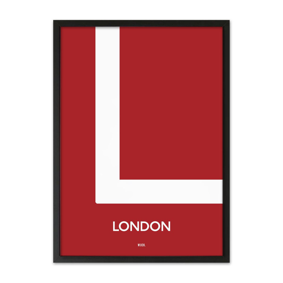
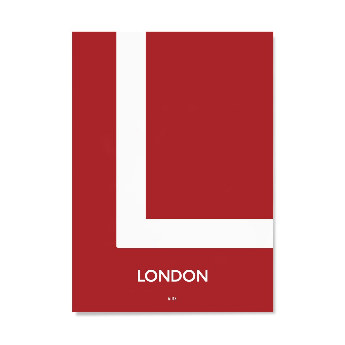
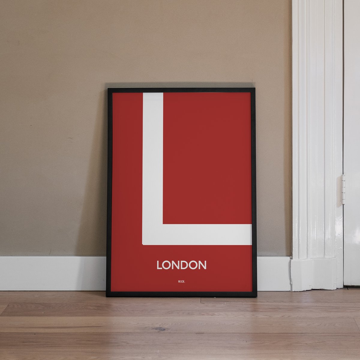
L from London
Few things are as instantly recognizable as the typography of the London Underground. The Johnston typeface, designed in 1916 for the metro, became so influential in British graphic design that it is still in use nearly a century later. The L from London is a tribute to that legacy: clear, democratic, and robust. A letter for everyone, on its way to everywhere.
Discover the full Typography Collection here.
- 100% Ecofriendly produced
- Free delivery from €45 (Only Europe)
- Delivered within 3-5 days
- Call +31(0)20 348 48 73
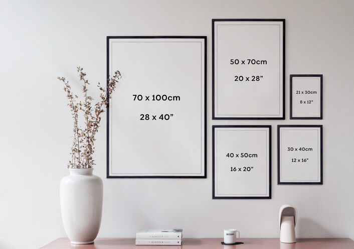
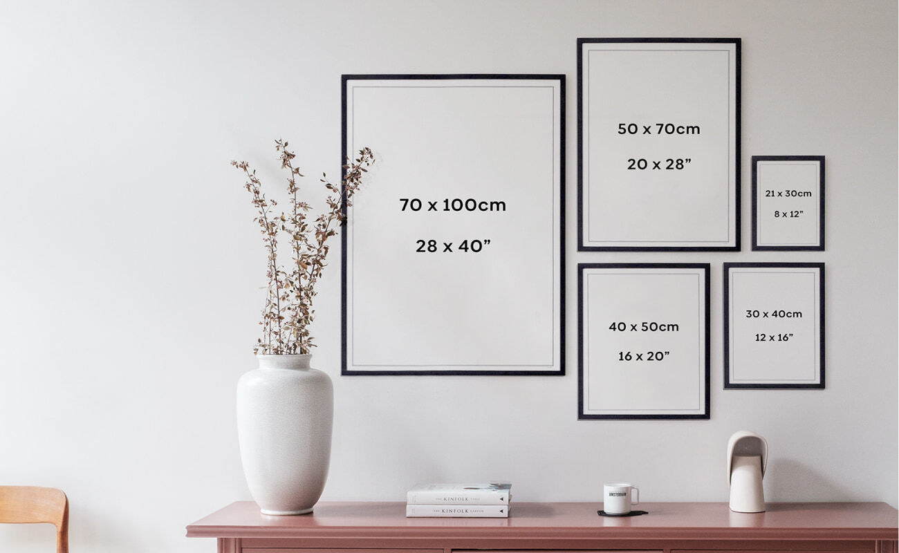
Sizes
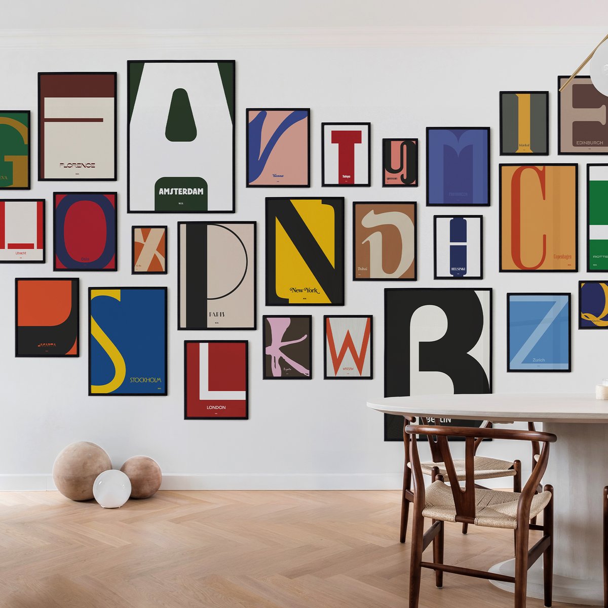
At WIJCK. there is a perfect size available for every room. And of course, combining various formats is an ideal way to make a beautiful collage of your favorite cities and places. Need advice? We are happy to help you find the perfect size.
Product details
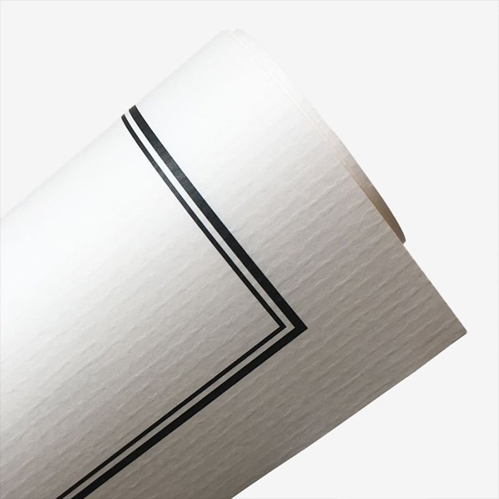
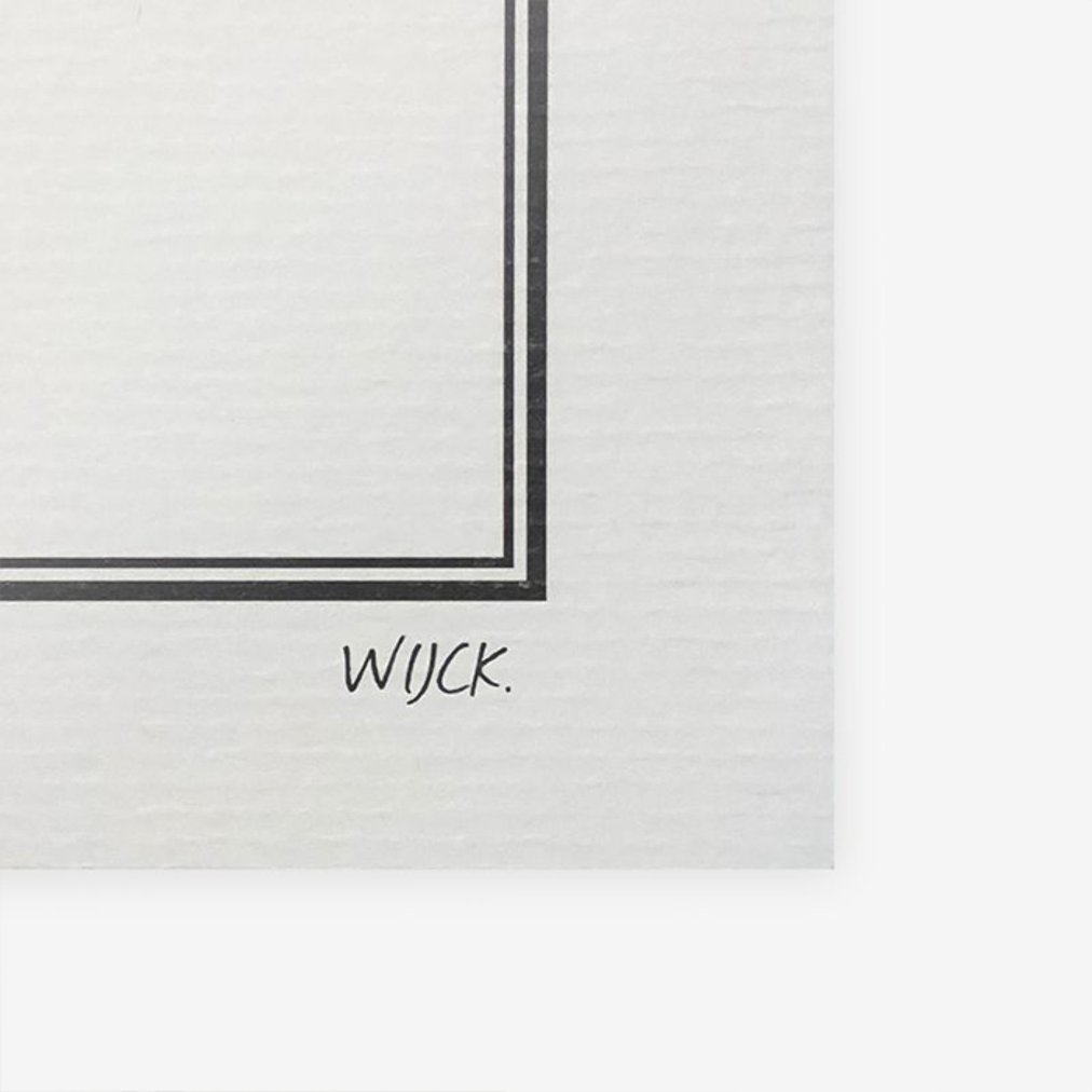
Gallery Quality paper
At WIJCK. we attach great importance to the quality of our posters and we like to combine our sleek design with a touch of nostalgia! The paper we use contains a combination of recycled cotton and wood-free ingredients. In addition, the paper is FSC certified. With a subtle relief, the paper gives the poster a classic yet timeless look.
Biodegradable ink
In addition to using sustainable and high-quality paper, the inks we use in producing our posters are biodegradable. These are made from natural, plant-based ingredients that can be easily broken down without harming the environment. In addition, our ink remains colorfast much longer than the usual inks due to the natural base.

FSC Wooden frames
Our frames also have a sustainable character. The wood of our frames is sustainably obtained from Italy and contains an FSC quality mark, which stands for wood obtained from responsibly managed forests. The frames are provided with a matte black finish and processed by hand at our frame maker in Zoetermeer (NL). The frames can also be ordered separately without a poster.
At WIJCK. we attach great importance to the quality of our posters and we like to combine our sleek design with a touch of nostalgia! The paper we use contains a combination of recycled cotton and wood-free ingredients. In addition, the paper is FSC certified. With a subtle relief, the paper gives the poster a classic yet timeless look.
In addition to using sustainable and high-quality paper, the inks we use in producing our posters are biodegradable. These are made from natural, plant-based ingredients that can be easily broken down without harming the environment. In addition, our ink remains colorfast much longer than the usual inks due to the natural base.
Our frames also have a sustainable character. The wood of our frames is sustainably obtained from Italy and contains an FSC quality mark, which stands for wood obtained from responsibly managed forests. The frames are provided with a matte black finish and processed by hand at our frame maker in Zoetermeer (NL). The frames can also be ordered separately without a poster.
You may also like...

In 1916, Frank Pick, the visionary behind the visual identity of the London Underground, asked the artist Edward Johnston to design a new typeface for the metro. The result, Johnston Sans, changed the course of British graphic design. Clear, legible from a distance, friendly yet authoritative, it was a typeface that perfectly matched the idea of the underground itself, a network that belonged to everyone and served everyone.
That democratic idea runs deep in the character of the London Underground. When it opened in 1863, it was the first of its kind in the world, and it has always held a unique place in the life of the city. It connects neighborhoods that might otherwise have little in common. It is the system that keeps London moving.
The L from London in the Typography Collection by WIJCK. pays tribute to that tradition. The design draws directly from the visual language of the underground: the rounded forms of the Johnston typeface, the clear color coding introduced by Harry Beck in 1933 with his iconic tube map, and the combination of red, blue and white that makes London instantly recognizable across the world.
London is a city of layers, historical, cultural, architectural. Yet perhaps its most democratic layer is the underground, carrying millions of people through the city every day. The L from London is a poster for those who love that city, who live there or once did, and who know the underground as an old friend.
Available in multiple sizes, printed on high-quality paper.
Discover the full Typography Collection here.