Eco-friendly
All of our products are based on natural ingredients
Fair prices
High quality design products for affordable prices.
Worldwide shipping
From Amsterdam to everywhere, shipped in max 5 days!
.jpg/public)
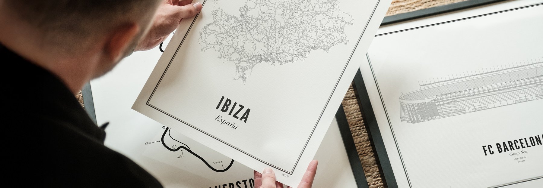
Posters
Products
Collections
Bestsellers
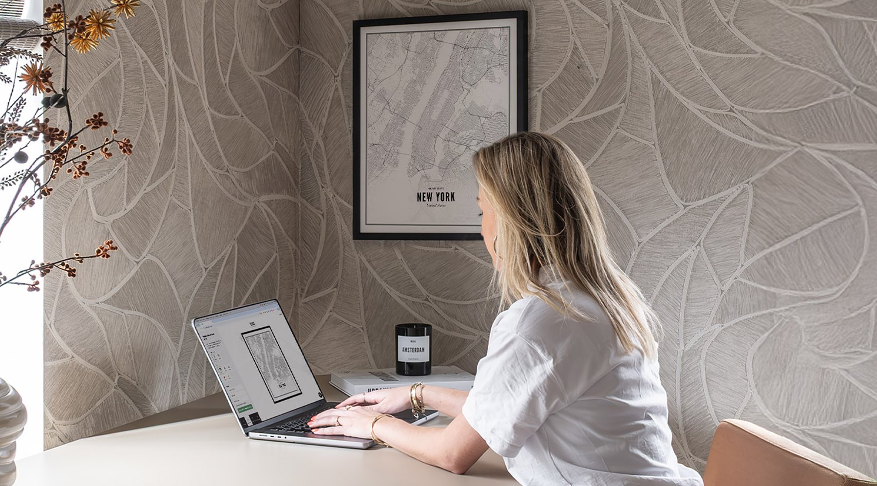
Create your own
Create your own
Collections
Collections
Collaborations
Bestsellers

Home Fragrance
Products
Specials
Bestsellers
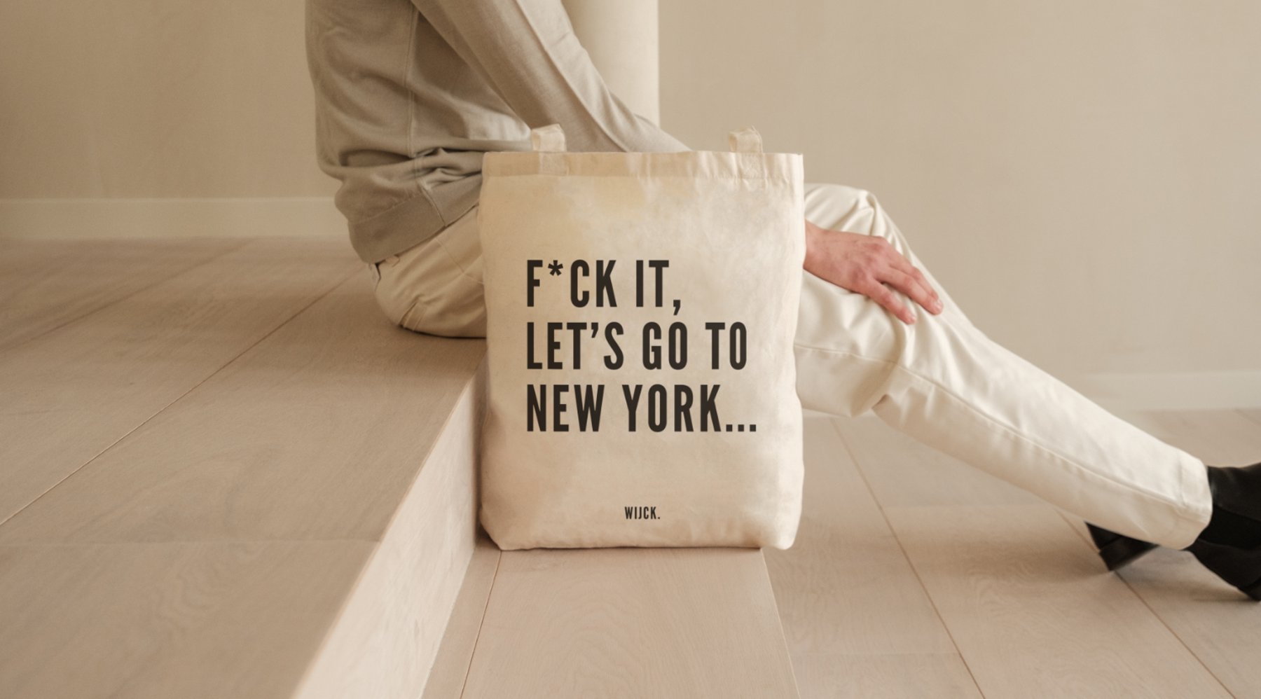
Tote Bags
Products
Posters
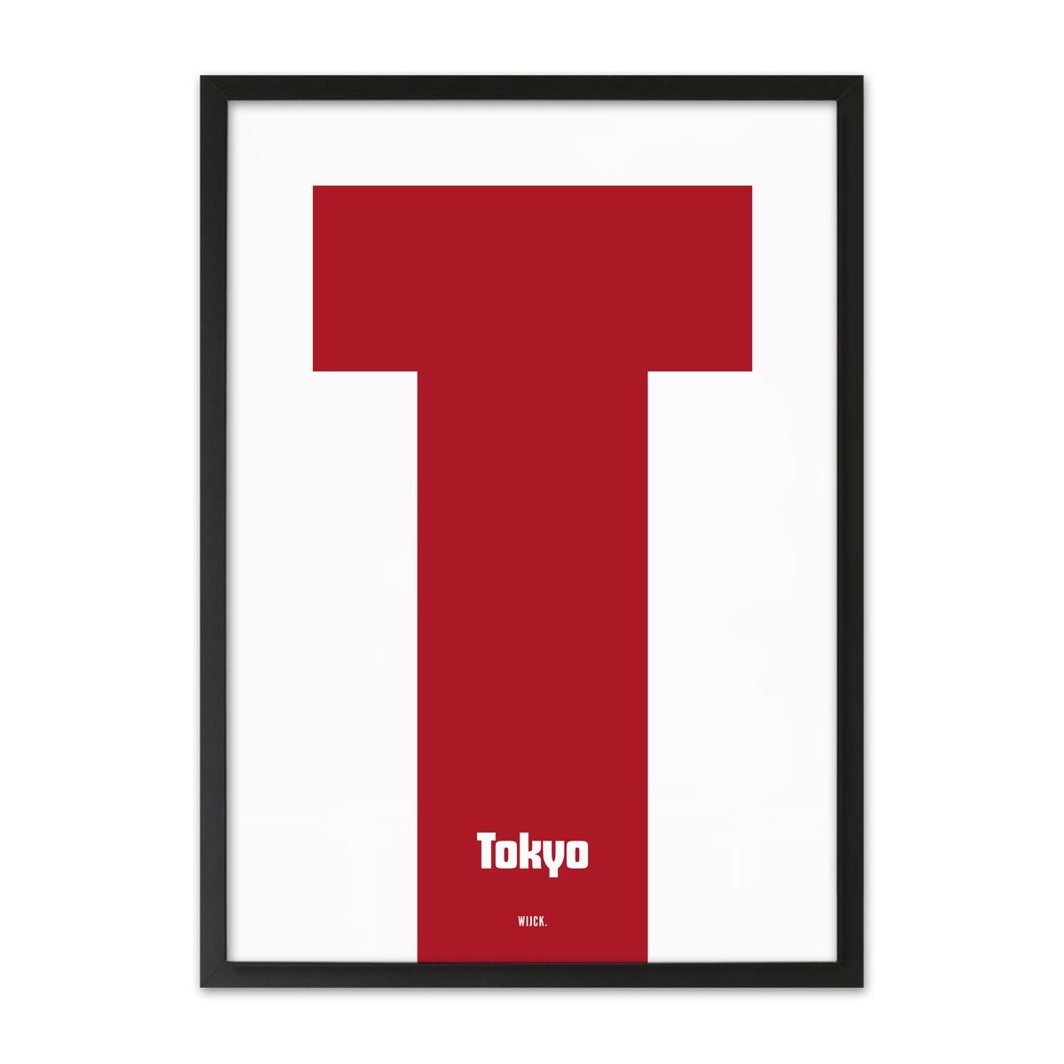
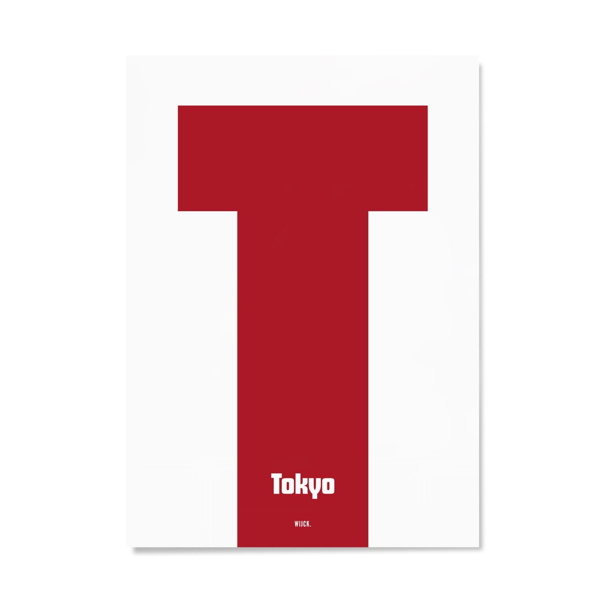
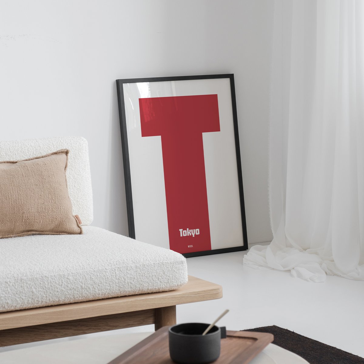
T from Tokyo
Tokyo in the 1970s and 1980s was the city of the future, a future that looked like an arcade hall. Neon signage, pixel graphics, the aesthetic of Atari and early video game culture, much of it created in or for a Japanese market that was far ahead of the world in technology. The T from Tokyo celebrates that era. Red, white, retro and yet timeless.
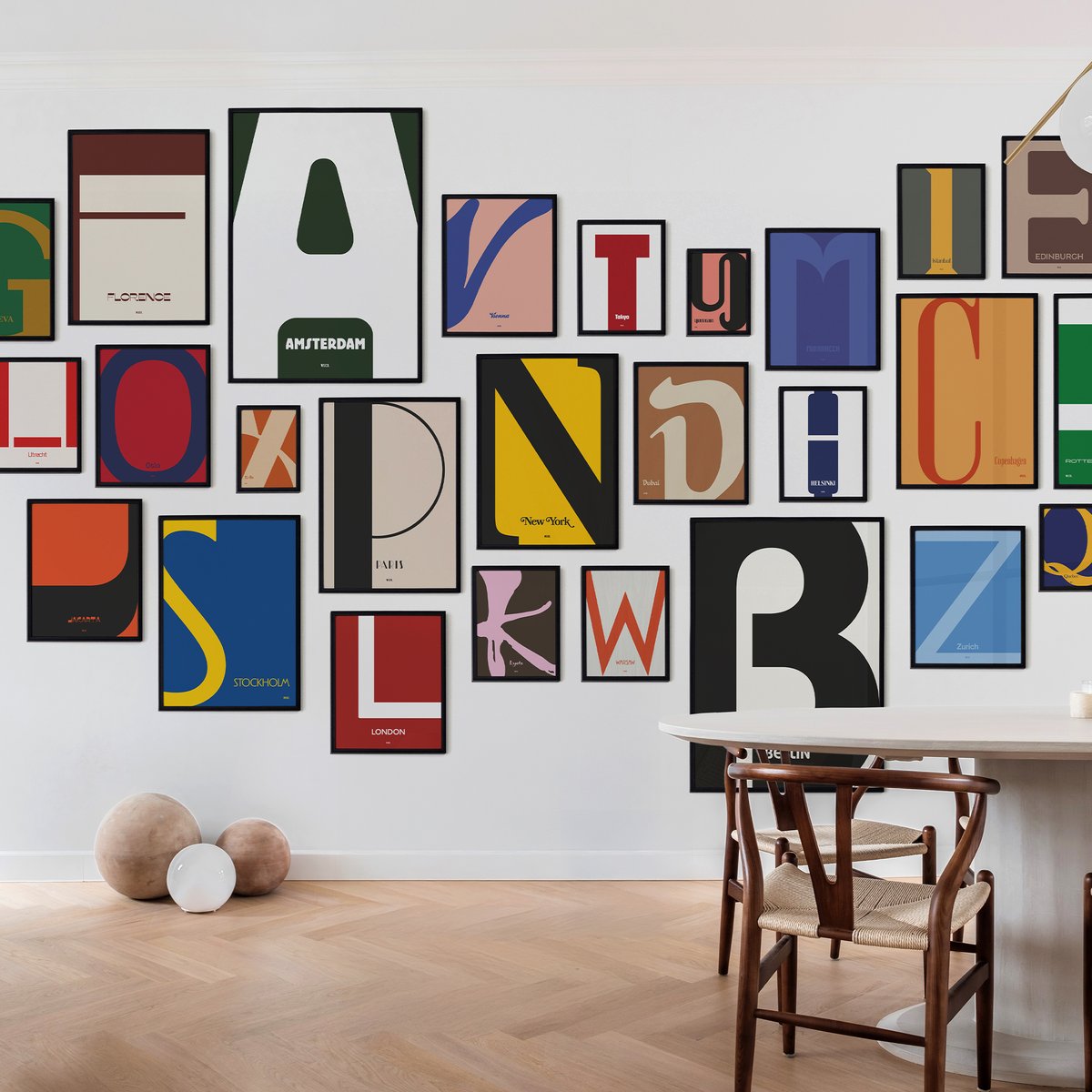
Discover the full Typography Collection here.
- 100% Ecofriendly produced
- Free delivery from €45 (Only Europe)
- Delivered within 3-5 days
- Call +31(0)20 348 48 73
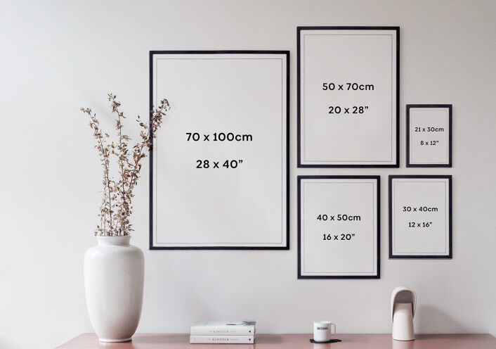
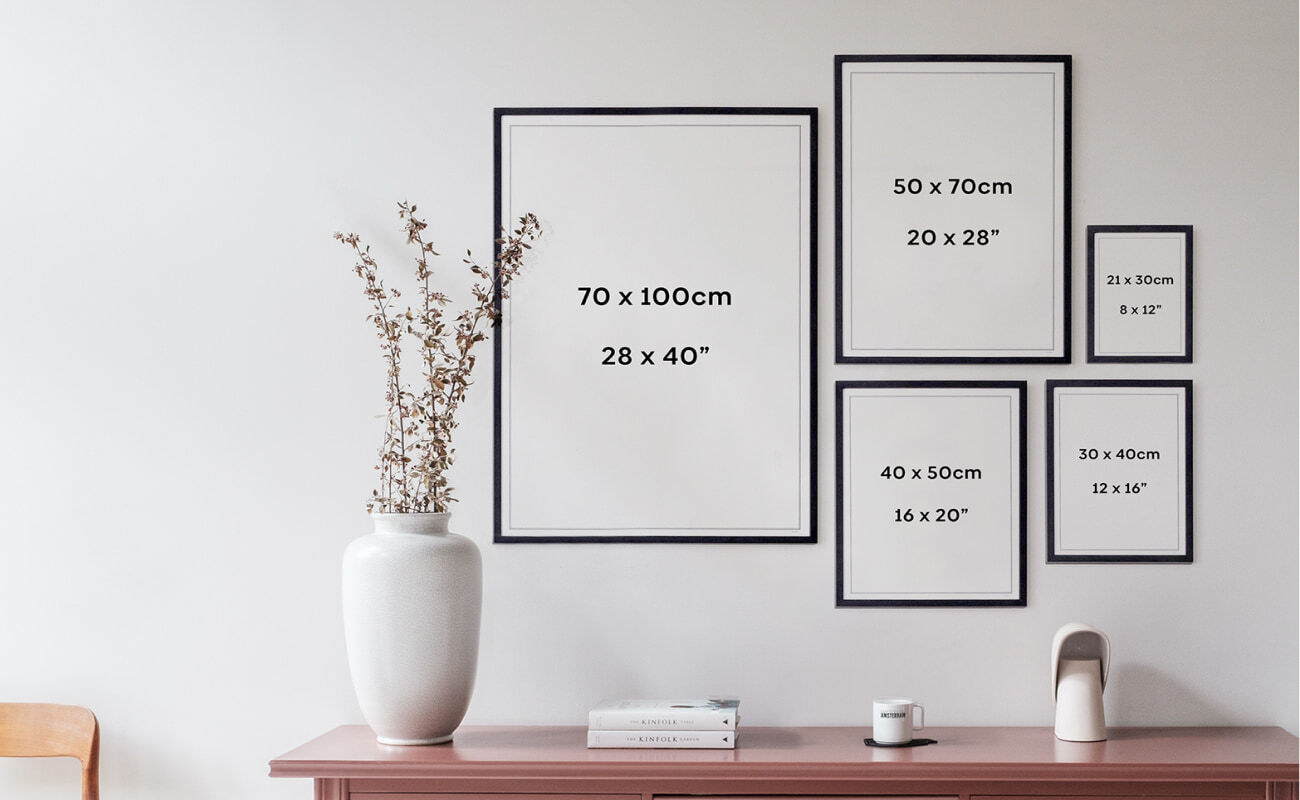
Sizes
At WIJCK. there is a perfect size available for every room. And of course, combining various formats is an ideal way to make a beautiful collage of your favorite cities and places. Need advice? We are happy to help you find the perfect size.
Product details
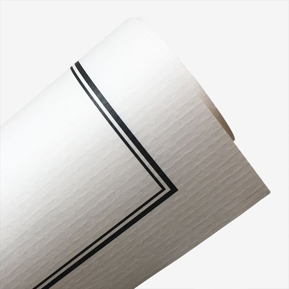
Gallery Quality paper
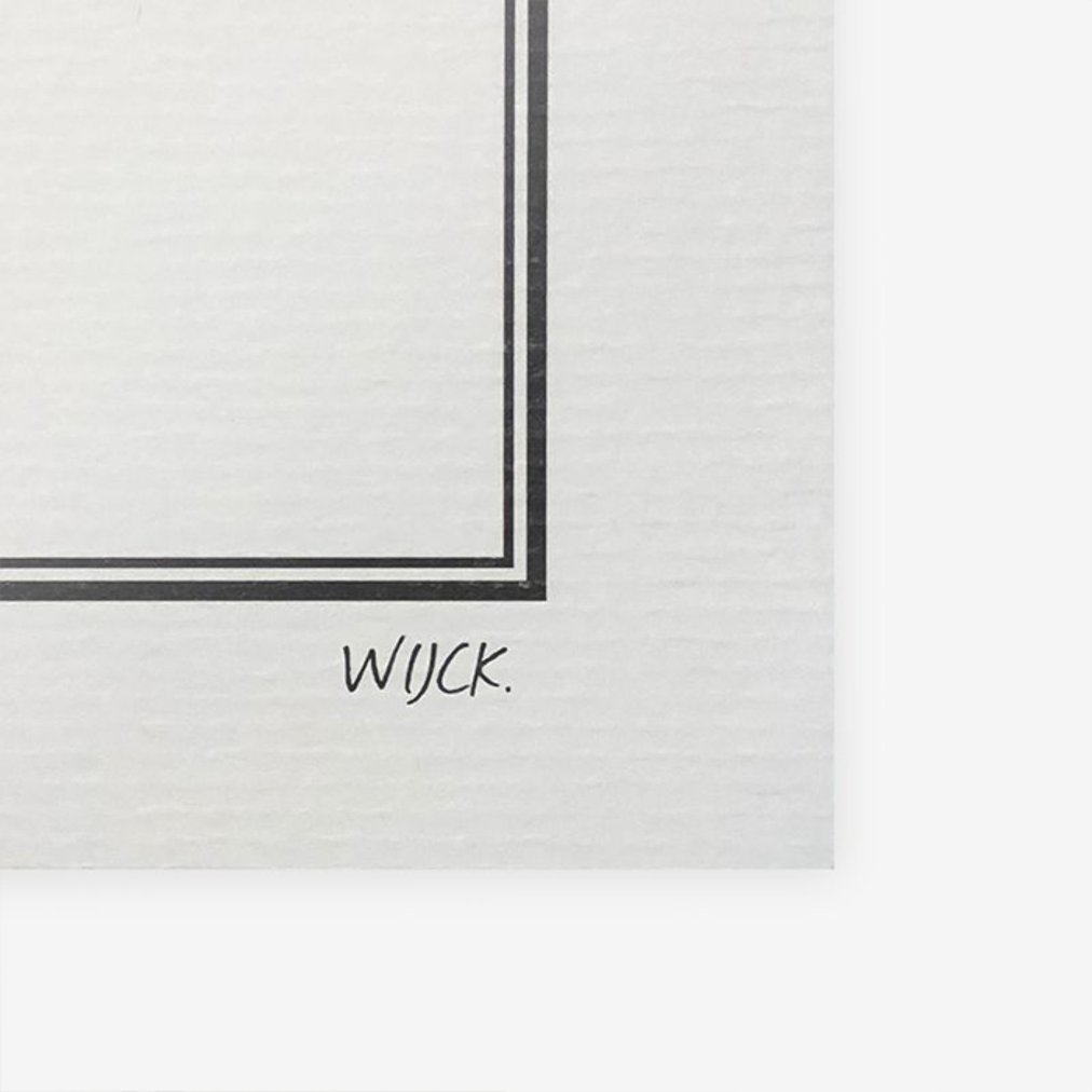
At WIJCK. we attach great importance to the quality of our posters and we like to combine our sleek design with a touch of nostalgia! The paper we use contains a combination of recycled cotton and wood-free ingredients. In addition, the paper is FSC certified. With a subtle relief, the paper gives the poster a classic yet timeless look.
Biodegradable ink
In addition to using sustainable and high-quality paper, the inks we use in producing our posters are biodegradable. These are made from natural, plant-based ingredients that can be easily broken down without harming the environment. In addition, our ink remains colorfast much longer than the usual inks due to the natural base.
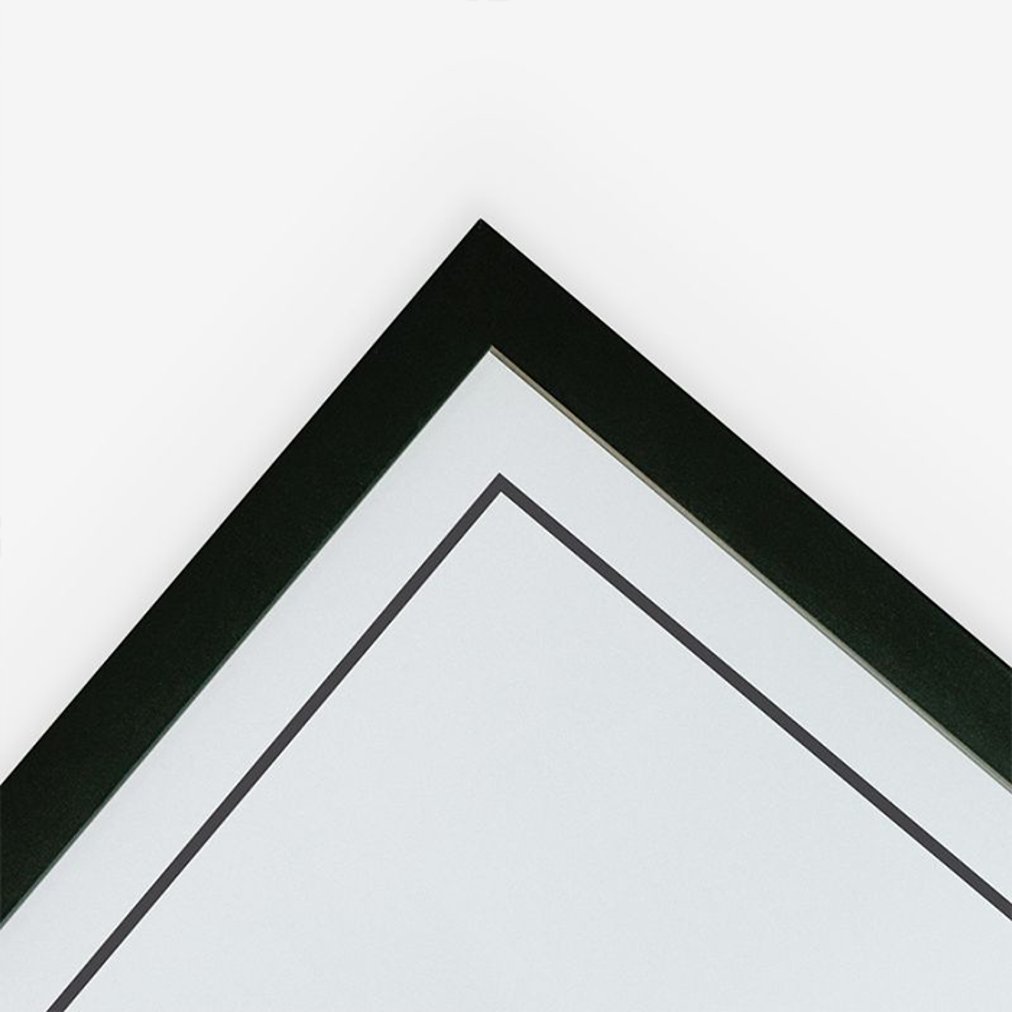
FSC Wooden frames
Our frames also have a sustainable character. The wood of our frames is sustainably obtained from Italy and contains an FSC quality mark, which stands for wood obtained from responsibly managed forests. The frames are provided with a matte black finish and processed by hand at our frame maker in Zoetermeer (NL). The frames can also be ordered separately without a poster.
At WIJCK. we attach great importance to the quality of our posters and we like to combine our sleek design with a touch of nostalgia! The paper we use contains a combination of recycled cotton and wood-free ingredients. In addition, the paper is FSC certified. With a subtle relief, the paper gives the poster a classic yet timeless look.
In addition to using sustainable and high-quality paper, the inks we use in producing our posters are biodegradable. These are made from natural, plant-based ingredients that can be easily broken down without harming the environment. In addition, our ink remains colorfast much longer than the usual inks due to the natural base.
Our frames also have a sustainable character. The wood of our frames is sustainably obtained from Italy and contains an FSC quality mark, which stands for wood obtained from responsibly managed forests. The frames are provided with a matte black finish and processed by hand at our frame maker in Zoetermeer (NL). The frames can also be ordered separately without a poster.
You may also like...

There is a period in Japanese cultural history that only later revealed its true significance: the 1970s and 1980s, when Japan flooded the world with electronics, video games, anime and an aesthetic that would permanently reshape Western popular culture.
Atari may have been American, but much of the DNA of early video game culture was Japanese. Nintendo, Sega, the Famicom, they all came from Japan, and the visual language they developed was directly connected to the urban aesthetic of the time: neon colors, pixel graphics and a form of futurism that was optimistic in a way that now feels nostalgic.
Tokyo was the epicenter. A city that has always moved faster than the rest of the world, that transformed Akihabara into a district dedicated entirely to electronics, that introduced the manga café, the capsule hotel and the konbini, the 24-hour convenience store that functions as a small world in itself. Tokyo in the 1980s was a city that believed the future had already arrived.
The T from Tokyo in the Typography Collection by WIJCK. carries that atmosphere. The colors are those of the Japanese flag, red and white, translated into a graphic language that refers to the arcade culture of the era. Pixels as building blocks, energy as color, a retro-futuristic sensibility that aligns with how we remember that period today.
Available in multiple sizes, printed on high-quality paper.
Discover the full Typography Collection here.